- June 20, 2026
Best Color Combinations for Printed T-Shirts
Have you ever finalized a custom t-shirt design only to realize the finished product didn’t look nearly as impressive as it did on screen? In many cases, the issue isn’t the artwork itself but the t-shirt color combinations chosen during production. The right t-shirt color combinations can make a design stand out instantly, while poor choices can reduce visibility, weaken branding, and leave apparel looking outdated or unprofessional.
Whether you’re creating business uniforms, promotional merchandise, event apparel, or personalized clothing, understanding how shirt color matching, best ink colors, and custom shirt color ideas work together can dramatically improve the final result. Choosing the right combination helps maximize contrast, improve readability, and ensure your custom apparel remains eye-catching and memorable long after it leaves the printer.
Why Color Choices Matter More Than Most Realize
Color directly influences first impressions and long-term satisfaction with custom shirts. Strong combinations create visual harmony and readability from a distance, while poor ones cause designs to disappear or feel unprofessional. In screen printing, ink interacts with fabric in specific ways, making thoughtful pairing essential for opacity, durability, and overall appeal.
Beyond aesthetics, color affects perceived value. Well-chosen palettes reinforce brand identity, evoke desired emotions, and increase the likelihood that recipients will actually wear the shirt. For businesses, schools, and organizations, this translates to better visibility and stronger connections with audiences.
Understanding Color Theory Basics for Apparel
Color theory provides a reliable foundation for successful t-shirt projects. Complementary colors sit opposite each other on the color wheel and create high contrast, making designs stand out. Analogous colors sit next to each other and produce harmonious, low-contrast looks ideal for subtle or vintage aesthetics.
Consider the psychology behind hues as well. Blues convey trust and calmness, often suiting corporate or athletic wear. Reds and oranges energize and attract attention, suiting promotional or sports apparel. Neutrals like black, white, and gray serve as versatile bases that let bolder ink colors shine.
Fabric color also changes how ink appears. A white shirt brightens inks, while a black shirt requires underbase layers for light colors to achieve vibrancy. Testing combinations on actual garments reveals nuances that digital previews might miss.
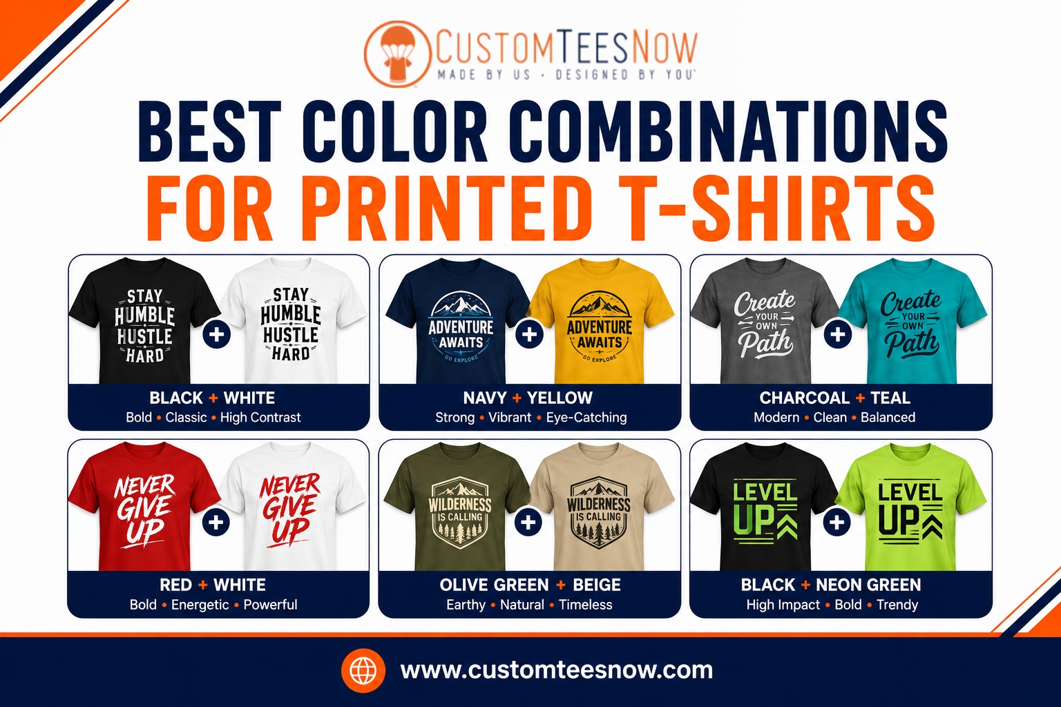
Classic and Timeless Color Pairings
Certain pairings consistently deliver excellent results across various printing methods. Black shirts with white or metallic gold ink create sophisticated, high-contrast looks favored by brands and bands. White shirts paired with navy, black, or deep red offer clean, versatile appeal suitable for almost any design.
Heather gray bases work beautifully with black, royal blue, or bright neon inks, providing a modern, slightly textured background. For youth or fun-oriented projects, combinations like turquoise with coral or purple with lime green inject energy and playfulness.
These classics remain popular because they balance readability, print durability, and broad appeal. They adapt well to different design styles, from minimalist text to detailed illustrations.
Bold and Modern Combinations That Stand Out
Contemporary trends favor unexpected yet balanced pairings. Consider deep forest green bases with vibrant yellow or cream ink for an earthy yet eye-catching effect. Maroon shirts with white and gold accents project premium quality for alumni or corporate groups.
For fashion-forward looks, try charcoal with bright teal, or soft blush pink with black and metallic silver. These combinations leverage contrast while maintaining a current feel. Seasonal adaptations also work well—rich burgundies and oranges for fall events or crisp blues and yellows for spring campaigns.
When working with multiple inks, limit the palette to three or four colors maximum. This restraint prevents visual clutter and controls production costs effectively.
Matching Shirt Colors to Specific Uses and Audiences
Different contexts call for tailored approaches. Corporate apparel benefits from conservative yet professional pairings like navy with white or black with silver. Sports teams often choose high-visibility options such as black with neon green or royal blue with bright orange for strong team identity.
Event merchandise shines with vibrant, thematic combinations. Weddings might use soft pastels on white or ivory bases, while music festivals embrace bold neons on dark backgrounds. Family reunions or school groups frequently prefer bright, cheerful palettes that photograph well and appeal across generations.
Always consider skin tones and garment fit when recommending options. Lighter bases tend to flatter a wider range of wearers, while darker ones create a slimming effect but require careful ink selection.
Here are some effective pairings organized by base shirt color:
- Dark bases (Black, Navy, Charcoal): White, Gold, Silver, Neon colors, Bright red
- Light bases (White, Ash, Heather Gray): Black, Navy, Red, Royal Blue, Deep Green
- Colored bases (Red, Blue, Green): White or off-white underbase with contrasting accents
| Black | White, Gold, Neon Yellow, Red | Bold branding, bands, premium looks | High |
| White | Black, Navy, Forest Green, Maroon | Clean, versatile, corporate | High |
| Heather Gray | Black, Royal Blue, Coral, Teal | Modern casual, everyday wear | Medium-High |
| Navy | White, Gold, Light Blue, Orange | Professional, sports, uniforms | High |
| Red | White, Black, Cream, Yellow | Energetic events, schools | Medium |
This table offers quick reference points while highlighting how different bases influence final appearance.
Technical Considerations for Screen Printing Success
Screen printing demands attention to how colors interact during production. Light inks on dark shirts usually require a white underbase for proper opacity, adding a layer that affects hand feel and cost. Dark inks on light shirts generally print more directly but still benefit from testing for vibrancy.
shirt color matching becomes especially important when aligning ink to specific Pantone references, ensuring consistency across large orders and future reorders.
Best ink colors maintain their intensity through multiple washes when properly cured. Certain combinations, such as white ink on colored shirts, may need extra attention to prevent cracking over time. Consulting with your printer about specific garment and ink pairings prevents surprises during production.
Creative Custom Shirt Color Ideas for Different Projects
Event planners often seek distinctive palettes that capture the theme. A beach cleanup might use ocean blues with sandy neutrals, while a charity run could combine bright yellow bases with black and green accents for energy and visibility.
Businesses building merchandise lines benefit from cohesive palettes across multiple items. A coffee shop might use warm browns, oranges, and creams, creating instant brand recognition. Personal projects allow more experimentation—perhaps a favorite sports team’s colors or meaningful family hues.
For groups with diverse preferences, offering a few coordinated options increases satisfaction. Providing mockups in different combinations helps decision-makers visualize results before committing to large quantities.
Avoiding Common Color-Related Pitfalls
Several frequent issues can undermine even strong designs. Insufficient contrast causes text or fine details to disappear from a distance. Overly similar hues create muddy appearances, especially after printing. Ignoring how lighting affects perception—retail stores versus outdoor events—leads to unexpected shifts.
Metallics and specialty inks add premium appeal but require compatible bases and sometimes additional processes. Testing small samples reveals how specific best ink colors perform on chosen fabrics before scaling up.
Practical Tips for Selecting Your Palette
Begin by identifying the primary message or emotion you want to convey. Collect inspiration from existing brands you admire or current design trends. Use digital tools to preview combinations on virtual shirts, then request physical samples for final confirmation.
Consider the full product line. A palette that works on t-shirts should also translate well to hoodies, hats, or other items if needed. Factor in budget—fewer colors generally reduce costs while still allowing creative expression.
Collaborating with Experts for Optimal Results
Experienced printers review proposed color combinations and suggest refinements based on their equipment and material knowledge. They can recommend adjustments that improve durability or reduce expenses without sacrificing visual impact.
For those ready to move forward with professional guidance, Custom Tees Now offers expert advice on color selection alongside high-quality screen printing and customization services.
For more inspiration on current design trends, explore resources from Behance where creatives share successful apparel projects. The Color Matters website also provides valuable insights into color psychology and effective pairings.
Bringing Your Vision to Life with Confidence
Selecting effective t-shirt color combinations combines artistic judgment with practical production knowledge. By applying color theory, considering your audience and purpose, and testing real-world results, you create apparel that looks exceptional and performs reliably over time.
The right choices transform ordinary shirts into powerful tools for branding, celebration, or self-expression. Thoughtful palettes ensure your custom pieces receive compliments instead of collecting dust in drawers.
Ready to develop winning color strategies for your next order? Custom Tees Now provides the expertise, quality materials, and personalized service to help you achieve outstanding printed t-shirts. Contact our team or explore our design options today to start building apparel that truly stands out.