
- July 20, 2026
How to Match Ink Colors to Fabric Colors
Have you ever approved a custom t-shirt design only to find the printed colors looked completely different on the finished garment? The success of any custom apparel project depends on more than choosing attractive colors—it also requires proper ink color matching. Selecting the right ink for each fabric color improves visibility, enhances brand consistency, and produces professional-looking results that last.
Whether you’re designing company uniforms, promotional apparel, event merchandise, or retail clothing, understanding how fabric color printing affects shirt ink colors can make a significant difference in the final product. This guide explains practical custom apparel color matching techniques, recommended color combinations, and production tips that help your designs stand out on every garment.
Why Precise Ink Color Matching Is Essential for Brand Success
Color consistency builds instant recognition and trust. Inconsistent prints, on the other hand, can make even premium designs appear unprofessional. For businesses in Naples and across the country, reliable ink color matching protects your reputation and maximizes the impact of every garment.
Fabric color matching becomes especially critical when ordering mixed styles or reordering months later. Small variations in shirt brands, dye lots, or printing methods can create noticeable differences that undermine your visual identity. Fabric color matching ensures your designs maintain harmony across different garments.
Understanding How Fabrics and Inks Interact
The foundation of successful ink color matching lies in the relationship between fabric and ink. Cotton fabrics absorb ink deeply, creating a soft hand feel with rich saturation on light bases. Polyester and performance blends repel ink more, often requiring specialized formulations or underbasing for vibrant, durable results.
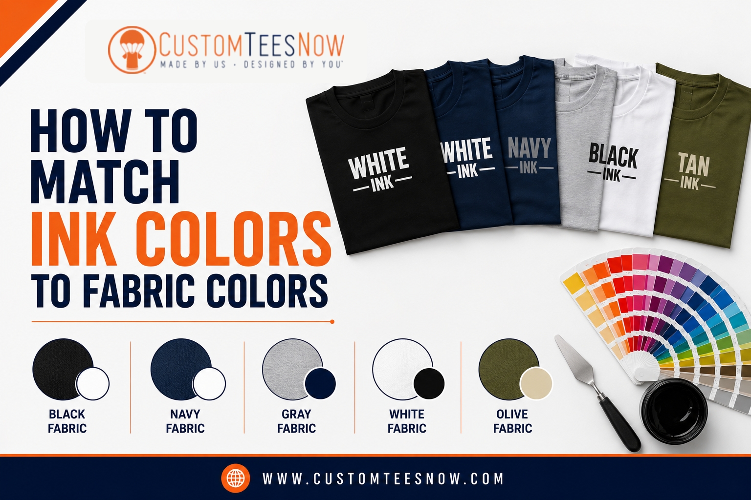
Shirt color combinations dramatically change outcomes. Light shirts (white, heather gray, natural) allow inks to display close to their true tone. Dark shirts (black, navy, deep red) demand an opaque white underbase layer so your colors “pop” instead of blending with the dark background. Strategic shirt color combinations help achieve the best visual impact.
Different shirt brands also behave uniquely. A heavyweight cotton from one manufacturer may hold ink differently than a lightweight tri-blend from another. These subtle differences make testing and communication with your printer essential.
Key Factors That Determine Ink Color Matching Success
Several variables influence final results:
- Printing Method: Screen printing excels at bold, solid colors with excellent opacity. DTG printing handles complex artwork and gradients best on lighter fabrics.
- Ink Formulation: Opaque inks perform better on dark fabrics while softer water-based inks create vintage effects on cotton.
- Garment Construction: Blends, textures, and treatments (such as moisture-wicking finishes) all affect ink adhesion and appearance.
- Curing and Finishing: Proper heat curing ensures durability and colorfastness through repeated washing.
Strategic Shirt Color Combinations That Deliver Professional Results
Choosing effective shirt color combinations maximizes contrast, readability, and visual appeal. High-contrast pairings remain the most reliable choice. White ink on black or navy bases creates clean, timeless graphics. Bright yellow or orange on royal blue delivers energetic, attention-grabbing results ideal for sports and events.
Earth-tone combinations like olive green shirts with beige or brown ink convey quality and sophistication for outdoor or lifestyle brands. For corporate clients, charcoal gray bases with metallic accents offer a modern premium look.
When working with lighter garments, deep navy, black, or forest green inks provide excellent definition. On darker bases, light or highly opaque inks maintain vibrancy when paired with proper underbasing techniques.
Real-World Example: A local Naples restaurant chain wanted their red and white logo on black polo shirts for staff uniforms. Without underbasing, the red appeared dull. After adjustments, the final shirts delivered vibrant, consistent color that withstood daily wear and frequent washing.
Proven Best Practices for Reliable Ink Color Matching
- Specify Colors Accurately: Always reference Pantone Matching System (PMS) colors. Visit Pantone’s official website to select and share exact numbers with your printer.
- Prepare High-Quality Artwork: Use vector files with spot colors where possible. Maintain consistent color profiles and avoid unnecessary conversions that shift appearance.
- Request Physical Proofs: Digital mockups provide a good starting point, but physical samples on the actual garment and fabric color reveal true results.
- Collaborate with Experts: Share your brand guidelines and intended use (indoor/outdoor, washing frequency, etc.). Professional art departments can make targeted adjustments.
Our design now tool at Custom Tees Now lets you experiment with colors in real time before submitting for expert review.
Advanced Techniques for Challenging Fabric Color Matching
For multi-garment orders, develop separate but coordinated color recipes. A full-color logo on white shirts might simplify to 2-3 colors on black variants while maintaining visual unity.
Specialty applications require additional planning. Embroidery thread colors differ from printed inks, so request thread charts and samples. Metallic and specialty inks add visual interest but often need testing for durability.
Case Study: A Southwest Florida youth sports organization ordered mixed apparel including performance tees, hoodies, and caps. By creating optimized versions for each base fabric, they achieved cohesive branding across the entire uniform set. The key was early collaboration and multiple rounds of sampling.
Common Ink Color Matching Challenges and Solutions
- Color Shifting Under Different Lighting: Review samples in both daylight and indoor conditions.
- Fading After Washing: Use high-quality inks and follow proper curing protocols. Instruct customers to wash inside out in cold water.
- Loss of Detail on Dark Fabrics: Increase minimum line weights and use bold fonts for small text.
- Inconsistent Results Across Reorders: Maintain approved art separations and fabric specifications for future orders.
Quick Checklist for Successful Ink Color Matching Projects
- Define brand colors using PMS references
- Select garments and request material samples
- Prepare vector artwork with proper color settings
- Request physical proofs on final fabrics
- Document all specifications for future reorders
- Review samples under intended lighting conditions
- Confirm washing and care instructions
Following this checklist significantly reduces surprises and improves outcomes.
Building Long-Term Consistency for Your Brand
Create a simple apparel style guide that includes approved colors, garments, logo placements, and printing specifications. This document becomes invaluable for team members or future orders.
Regular communication with a trusted printer like Custom Tees Now ensures your standards remain consistent over time, even as product lines evolve.
Ready to Achieve Perfect Ink Color Matching?
Mastering ink color matching transforms your custom apparel from average to outstanding. With the right knowledge, preparation, and partnership, you can confidently produce garments that accurately represent your brand.
Visit our custom printed t-shirts collection to explore options, or jump straight into the design now tool to start creating. Our team at Custom Tees Now is ready to provide expert guidance and proofs to bring your vision to life with precise, professional results.
Don’t leave your brand’s appearance to chance. Contact Custom Tees Now today and experience the confidence that comes with perfect ink color matching on every order.