- June 5, 2026
How to Prepare Artwork for Screen Printing: A Complete Guide for Professional Results
Imagine this: You’ve spent hours creating the perfect design for your business uniforms, promotional apparel, event merchandise, or team shirts. The logo looks sharp, the colors are exactly right, and every detail appears flawless on your computer screen. Then the finished garments arrive, and the print looks blurry, colors seem off, or small details have disappeared entirely.
In many cases, these issues are not caused by the printing process itself. Instead, they result from artwork that was not properly prepared before production.
Understanding how to prepare artwork for screen printing is one of the most important steps in achieving professional-quality custom apparel. Whether you’re ordering branded company uniforms, promotional merchandise, sports apparel, or Custom Printed T-Shirts, proper artwork preparation helps ensure sharp details, vibrant colors, and long-lasting print quality.
At Custom Tees Now, we work with businesses, schools, nonprofits, sports teams, and organizations that rely on professionally printed apparel to represent their brand. One of the most common challenges we encounter involves artwork files that require adjustments before production can begin. Fortunately, many of these issues can be avoided with proper planning and file preparation.
This comprehensive guide explains everything you need to know about screen-printing artwork requirements, including file formats, resolution standards, color separations, typography best practices, and professional design techniques to help ensure outstanding results.
Why Proper Artwork Preparation Matters in Screen Printing
Screen printing remains one of the most popular methods for apparel decoration because it produces vibrant colors, exceptional durability, and consistent results across large production runs. Unlike some digital printing methods, screen printing uses individual mesh screens to apply each color separately onto the garment.
Because every color requires its own screen, precision is critical from the beginning of the design process.
A small mistake in an artwork file can create production challenges that affect the final appearance of the finished product. Poor artwork preparation can lead to:
- Blurry or pixelated graphics
- Inconsistent color reproduction
- Registration issues between colors
- Missing fonts
- Production delays
- Additional artwork charges
- Reduced print durability
Businesses investing in professional Screen Printing Services benefit significantly from artwork that has been properly optimized for production. Clean files reduce delays, improve consistency, and help achieve superior print quality.
Investing time in artwork preparation ultimately saves money, reduces revisions, and creates apparel that better represents your brand.
Common Artwork Problems That Affect Screen Printing Quality
Even attractive designs can encounter problems during production when technical requirements are overlooked.
Understanding these common issues can help you avoid costly mistakes.
Low-Resolution Images
One of the most common problems involves using images downloaded from websites or social media platforms. These graphics are often optimized for screen viewing rather than professional printing.
A logo that looks acceptable online may become blurry or pixelated when enlarged for apparel decoration.
Missing Fonts
When artwork files contain live fonts, the printer must have access to the exact same typeface used during design creation.
If the font is unavailable, the software may substitute another font, potentially altering the design’s appearance.
Poor Color Separation
Screen printing requires each color to be separated for production. Artwork that improperly combines colors or lacks organization can cause registration issues and increase setup time.
Excessive Detail
Tiny text, thin lines, and highly intricate patterns may not reproduce clearly on fabric. Some details that appear sharp on a computer screen may disappear during printing.
Improper Sizing
Artwork designed without considering actual print dimensions may require scaling, which can affect image quality and design balance.
By identifying these potential issues before submission, customers can significantly improve final print quality while reducing production delays.
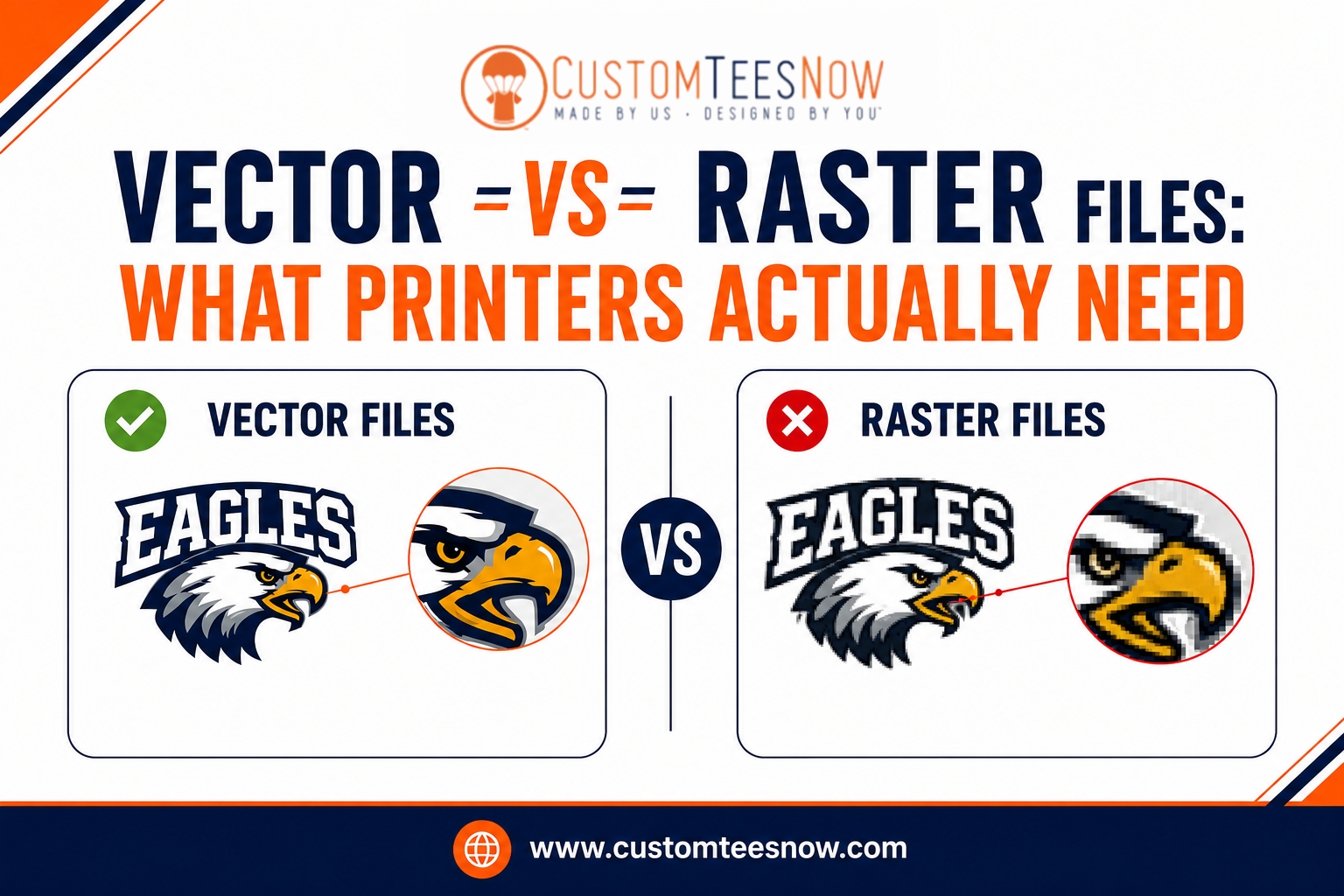
Understanding Vector vs. Raster Images for Screen Printing
One of the most important concepts in artwork setup for screen printing involves understanding the difference between vector and raster graphics.
What Are Vector Graphics?
Vector artwork uses mathematical paths, points, and curves rather than pixels. Because vectors are mathematically generated, they can be scaled infinitely without losing quality.
This makes vector graphics the preferred format for screen printing.
Common vector file formats include:
- AI
- EPS
- SVG
Most professional designers create vector artwork using Adobe Illustrator because it provides precise control over paths, typography, and color separations.
Advantages of vector graphics include:
- Infinite scalability
- Crisp edges
- Easy color separation
- Smaller file sizes
- Superior print quality
Vector artwork is especially important when creating logos and branding for Custom Work Shirts because it allows graphics to be resized without sacrificing clarity.
What Are Raster Images?
Raster graphics consist of individual pixels arranged in a grid.
Common raster formats include:
- JPG
- PNG
- PSD
- TIFF
Raster images work well for photographs and highly detailed artwork. However, they have fixed dimensions and lose quality when enlarged.
For screen printing, raster artwork should be created at a minimum of 300 DPI at final print size.
For example:
A design intended to print at 10 inches wide should contain approximately 3,000 pixels across to maintain professional quality.
Vector vs. Raster Comparison
| Feature | Vector Graphics | Raster Graphics |
| Scalability | Unlimited | Limited |
| Best Use | Logos, text, illustrations | Photos |
| Resolution Dependence | No | Yes |
| Screen Printing Quality | Excellent | Depends on DPI |
| File Formats | AI, EPS, SVG, PDF | JPG, PNG, PSD, TIFF |
For most screen printing projects, vector artwork provides the best results.
Choosing the Right File Formats for Screen Printing
Providing artwork in the correct file format can significantly streamline production.
Preferred Vector Formats
AI (Adobe Illustrator)
The industry standard for professional apparel artwork.
EPS
A widely accepted vector format that maintains scalability and editing capabilities.
Excellent for preserving vectors, typography, and layers when properly exported.
Preferred Raster Formats
PSD
Ideal for layered artwork and advanced editing.
TIFF
Maintains excellent image quality without compression issues.
PNG
Useful when transparency is required.
JPEG
Generally considered the least preferred option because compression can reduce image quality.
Whenever possible, submit editable vector files rather than flattened image formats.
Color Modes, Spot Colors, and Color Separations
Color management plays a critical role in professional screen printing.
Unlike digital displays that use RGB color, screen printing relies on physical ink colors applied directly to garments.
For the most accurate color reproduction, professional printers often use the Pantone Matching System (PMS).
Pantone colors help ensure:
- Consistent color reproduction
- Accurate brand color matching
- Better production control
- Reliable results across multiple orders
For multi-color designs, each color should exist on its own layer.
Examples include:
- PMS 186 Red
- PMS 123 Yellow
- White Underbase
- Black Detail
Proper color organization simplifies separations and improves registration accuracy during production.
Text and Typography Best Practices
Typography plays a major role in the success of a screen printing project. While fonts may appear perfect on screen, certain typefaces can pose challenges during production if not prepared correctly.
One of the most important steps is converting text to outlines before submitting artwork. Converting fonts to outlines transforms text into vector shapes, eliminating the possibility of font substitution or compatibility issues.
In Adobe Illustrator, this can be done by selecting the text and choosing:
Object > Path > Create Outlines
After converting text to outlines, save a separate editable version of your artwork in case future changes are needed.
Recommended Text Guidelines
To improve readability and print quality:
- Use font sizes of at least 6–8 points
- Avoid extremely thin script fonts
- Maintain stroke weights of at least 0.5–1 point
- Use strong color contrast against the garment color
- Avoid excessive decorative effects
Proper typography preparation helps ensure logos, slogans, and branding elements remain legible and professional after printing.
Design Complexity, Gradients, and Halftones
Screen printing produces its best results when artwork is designed with production limitations in mind.
Simple, bold graphics generally print more consistently than highly complex artwork.
Working with Gradients
Gradients can be reproduced through a process called halftoning.
Halftones use small dots of varying sizes to simulate shades and transitions between colors.
While effective, halftones require careful preparation and may not reproduce as smoothly on textured fabrics as they do on digital screens.
For highly detailed photographic designs, printers may recommend:
- Simulated process printing
- Process color printing
- Specialized halftone techniques
These methods allow more complex imagery while maintaining quality.
Managing Fine Details
Very thin lines and intricate details can become problematic during production.
To improve results:
- Maintain minimum line thicknesses
- Avoid tiny negative spaces
- Simplify overly detailed artwork
- Test designs at actual print size
A design that appears perfect when zoomed in on a monitor may behave differently once transferred to fabric.
Garment Color Considerations
Garment color directly impacts design preparation.
For example:
- Light garments often require fewer print layers
- Dark garments usually require a white underbase
- Bright garment colors may influence perceived ink colors
The same design principles apply to custom hoodies, where larger print areas often require additional planning to maintain visual balance and readability.
Step-by-Step Process to Create Print-Ready Artwork
Creating professional screen printing artwork involves several key steps.
Step 1: Set Up Your Document Correctly
Begin by creating an artboard that matches the intended print size.
Examples:
- Left chest logo: 3–4 inches wide
- Full front print: 10–12 inches wide
- Full back print: 10–14 inches wide
Starting with the correct dimensions helps avoid scaling issues later.
Step 2: Build the Design in Layers
Organize artwork using separate layers for:
- Logos
- Text
- Graphics
- Individual colors
Layer organization simplifies color separation and production setup.
Step 3: Convert Fonts and Expand Effects
Before submission:
- Convert text to outlines
- Expand appearances
- Outline strokes
- Remove hidden objects
This helps ensure artwork appears exactly as intended.
Step 4: Assign Spot Colors
Identify colors using Pantone references whenever possible.
Clearly label each color layer to improve communication with your printer.
Examples:
- PMS 186 Red
- PMS 123 Yellow
- White Underbase
Step 5: Review Color Separations
Check artwork carefully for:
- Missing elements
- Overlapping colors
- Registration concerns
- Unintended transparency effects
Viewing separations before submission helps identify problems early.
Step 6: Export Properly
Save artwork in a printer-friendly format such as:
- AI
- EPS
Include a mockup showing placement on the garment whenever possible.
Artwork Submission Checklist for Screen Printing
Before submitting artwork, verify the following:
✔ Text has been converted to outlines
✔ Vector files are used whenever possible
✔ Raster images are at least 300 DPI
✔ Spot colors are properly identified
✔ Layers are organized by color
✔ Linked images are embedded
✔ Fine details meet minimum print requirements
✔ Artwork is sized correctly for the intended print location
✔ Hidden objects have been removed
✔ Unnecessary effects have been flattened
✔ Final files are saved as AI, EPS, or print-ready PDF
Following this checklist can significantly reduce production delays and improve final print quality.
Common Mistakes to Avoid
Even experienced designers occasionally make mistakes that affect production.
Some of the most common include:
Using Low-Resolution Artwork
Web graphics are rarely suitable for professional printing.
Always verify image resolution before submission.
Leaving Fonts Unconverted
Live fonts can create unexpected appearance changes if the printer does not have access to the same typeface.
Ignoring Garment Color
Artwork should always be designed with the intended garment color in mind.
Using Too Many Colors
Every additional color increases setup time and production complexity.
Whenever possible, simplify designs while maintaining visual impact.
Submitting Incorrect File Formats
Editable vector files provide the greatest flexibility and the highest-quality results.
What Professional Screen Printers Look for Before Production
Before artwork enters production, professional printers conduct a thorough review process.
These reviews typically include:
- Resolution verification
- Font inspection
- Color separation analysis
- Print size evaluation
- Underbase planning
- Registration assessment
- Line thickness verification
- Garment compatibility review
At Custom Tees Now, every design undergoes an artwork review process to help identify potential concerns before production begins.
This extra step helps reduce delays, improve efficiency, and ensure the highest possible print quality.
Why Proper Artwork Preparation Benefits Businesses
Businesses rely on custom apparel for branding, marketing, employee identification, and promotional purposes.
Properly prepared artwork helps ensure:
- Consistent branding
- Professional presentation
- Long-lasting print durability
- Accurate logo reproduction
- Improved customer perception
Companies ordering custom work shirts, promotional apparel, uniforms, or event merchandise benefit significantly from artwork optimized for professional production.
High-quality artwork creates high-quality apparel.
Final Thoughts on Preparing Artwork for Screen Printing
Successful screen printing starts long before ink reaches a garment. Proper artwork preparation serves as the foundation for accurate color reproduction, crisp details, consistent registration, and long-lasting durability.
By using vector artwork whenever possible, maintaining proper resolution standards, organizing color separations, outlining fonts, and following industry best practices, you can dramatically improve the quality of your finished apparel.
Whether you’re creating branded uniforms, promotional merchandise, event apparel, or custom printed T-shirts, investing time in artwork preparation helps ensure your design performs exactly as intended throughout the production process.
If you’re looking for professional guidance, high-quality printing, and dependable customer support, Custom Tees Now offers expert artwork review, industry-leading screen printing services, and custom apparel solutions designed to bring your ideas to life. Contact our team today to get started on your next project and experience the difference that professionally prepared artwork can make.