- July 10, 2026
Typography Tips for Custom Apparel Design
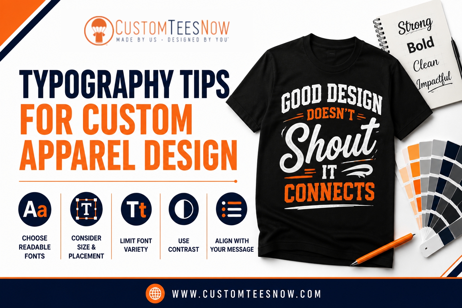
Have you ever created a custom t-shirt with a great message, only to find the text difficult to read once it was printed? Typography plays a major role in the success of any apparel design. Choosing the right typography for t-shirts improves readability, strengthens branding, and helps your message stand out whether you’re designing business uniforms, promotional apparel, event merchandise, or fashion collections.
From selecting the right fonts to balancing spacing, sizing, and alignment, every design decision affects the finished product. Understanding custom apparel typography, exploring effective t-shirt font ideas, and creating a clean shirt text design will help you produce professional-looking garments that leave a lasting impression. This guide covers practical typography principles that work across a wide variety of custom apparel projects.
Why Typography Matters More Than You Think
Typography is far more than choosing pretty letters. It directly affects readability, brand perception, emotional impact, and how long your garment stays in rotation. According to industry reports, apparel remains the top category in promotional products, and designs with clear, professional typography consistently see higher voluntary wear rates.
When your message is easy to read from a distance and feels intentional up close, the shirt stops being just merchandise — it becomes a source of pride. This is especially important for team uniforms, corporate gifts, event merch, and customer-facing apparel where your brand is on display daily.
Poor typography, on the other hand, leads to common frustrations: text that cracks after washing, designs that look cluttered, or lettering that disappears against the fabric. Mastering t-shirt typography helps you avoid these issues and creates lasting value.
Font Categories and When to Use Them
Different font families serve different purposes. Choosing the right category prevents production problems while strengthening your message.
Bold Sans-Serif fonts are the workhorses of custom t-shirt design. They offer excellent readability at distance and reproduce cleanly in both screen printing and embroidery. Perfect for sports teams, company slogans, and high-visibility applications.
Neutral Sans-Serif fonts provide clean, professional support text. They work beautifully for names, dates, taglines, and smaller details without competing with bolder headline fonts.
Slab Serif fonts deliver a strong, structured look ideal for schools, athletic programs, and heritage brands. They bring authority while remaining readable.
Script fonts add warmth and personality but must be used carefully. They shine in casual events and reunions when sized appropriately and kept simple.
Recommended Limit: Stick to one or two fonts per design. This creates a clear visual hierarchy and avoids a cluttered appearance.
| Bold Sans-Serif | Sports, slogans, team names | Excellent | Excellent | Bebas Neue, Impact, Anton |
| Neutral Sans-Serif | Corporate, staff shirts, details | Very Good | Excellent | Montserrat, Open Sans, Lato |
| Slab Serif | Schools, varsity, athletics | Excellent | Very Good | Rockwell, Roboto Slab |
| Script (Careful Use) | Reunions, casual events | Good (when enlarged) | Fair | Pacifico, Lobster |
Technical Considerations for Real-World Printing
Typography for t-shirts must survive the production process. Screen printing — our specialty for durability — requires fonts with sufficient stroke weight so fine details don’t fill in or break down. We recommend keeping minimum text height at 0.25 inches for most fonts. For embroidery, aim for 0.5 inches or taller to maintain clean stitching.
Fabric choice also plays a critical role. Performance polyester benefits from bolder, heavier fonts, while premium ring-spun cotton and tri-blend shirts allow slightly more detail. Our in-house team reviews every submission for these factors and sends a free digital proof, helping you catch issues before production begins.
Strategic Placement and Scaling Tips
Typography and placement work together to create balanced, professional results. Popular combinations include:
- A 3–4 inch left chest logo for branding
- A 10–14 inch full back design for main messages
- Sleeve or yoke accents for secondary details
Always scale typography according to viewing distance and garment movement. What looks perfect on a monitor can shrink dramatically once printed. During the proof stage, we help clients verify that text remains impactful across all sizes — from youth to extended adult fits. This approach is essential for successful custom t-shirt design.
Color Contrast, Pairing & Visual Hierarchy
Strong contrast is non-negotiable. Light ink on dark shirts and dark ink on light shirts deliver the best visibility. Previewing designs in grayscale is a quick way to test this.
Effective font pairing follows a simple rule: one bold display font for headlines and one clean supporting font for details. This approach guides the viewer’s eye naturally and maintains a polished look. In most screen printing jobs, limiting colors to three or fewer keeps costs reasonable while ensuring crisp results. Good t-shirt typography always considers these technical realities.
2026 Typography Trends in Custom Apparel
Current trends favor confident, purposeful typography. Oversized bold lettering paired with generous negative space continues to dominate for its graphic strength. Brands are also investing in subtle custom font modifications that feel unique without sacrificing readability.
Minimalist clean typography on high-quality garments is rising in popularity for corporate and premium gifting. At the same time, authentic hand-lettered styles — when executed with proper stroke weight — help brands connect emotionally with their audience. These trends make custom printed T-Shirts more impactful than ever.
Common Mistakes to Avoid
- Using overly decorative fonts that fail in production
- Setting text too small for the chosen print method
- Ignoring fabric texture when selecting fonts
- Combining too many font styles in one design
- Failing to test contrast on the actual garment color
Avoiding these pitfalls saves time and ensures better final results. In many cases, revisiting typography for t-shirts during the design phase prevents these common issues.
Best Practices for Outstanding Custom T-Shirt Design
Start with purpose. Define your audience, message, and usage before choosing fonts. Use vector files whenever possible for clean scaling. Test early and often during the proofing process.
For group orders, consistent typography across all garments builds stronger brand recognition. Our online design studio lets you preview typography directly on real products, making experimentation fast and accurate.
Ready to Create Something Exceptional?
Great typography transforms good custom apparel into great custom apparel — the kind people are proud to wear. At Custom Tees Now, we combine these design principles with expert in-house production, fast turnaround, free shipping, and a true satisfaction guarantee.
Whether you have a complete design or just a concept, our team is ready to help bring it to life with professional results. Explore our full range of custom t-shirt options and start your project today.