- June 10, 2026
Common Design Mistakes That Ruin Custom Shirts
Have you ever received a batch of custom shirts that looked completely different from what you imagined? Maybe the colors seemed dull, the text was difficult to read, or the design looked awkward once printed on the garment. Unfortunately, these problems are more common than many people realize and are often caused by avoidable t-shirt design mistakes made during the planning stage.
A great design on a computer screen doesn’t always translate into a great printed shirt. Factors such as artwork quality, color selection, typography, print placement, garment choice, and production preparation all play a critical role in the final result. Even small oversights can lead to printing errors, disappointing visuals, and custom apparel mistakes that reduce the impact of your project.
At Custom Tees Now, we’ve worked with businesses, schools, sports teams, nonprofits, and event organizers who want custom apparel that looks professional and lasts. Over the years, we’ve seen how common design issues can turn promising concepts into bad shirt designs that fail to meet expectations.
This guide explores the most common t-shirt design mistakes, explains why they happen, and provides practical solutions to help you create custom shirts that look great, wear comfortably, and represent your brand with confidence.
The High Cost of Overlooking Design Fundamentals
Custom shirts serve as walking billboards for your brand, message, or group. When designs suffer from fundamental flaws, they create negative impressions that last far longer than the ink. Poor choices in layout, color, or technical preparation result in blurry prints, fading colors, or garments that feel stiff and unwearable.
These issues affect more than aesthetics. They waste time during revisions, increase production costs, and reduce customer satisfaction. In contrast, thoughtful designs yield vibrant, long-lasting results that enhance perceived value and encourage repeat wear. Investing effort upfront in avoiding common errors pays dividends through higher-quality output and stronger connections with your audience.
Ignoring Print Method Compatibility
One frequent oversight involves selecting designs without considering the strengths and limitations of different printing techniques. Screen printing excels with bold, solid colors and performs best on simpler artwork, while detailed photographic images or complex gradients may require alternative approaches like direct-to-garment printing for optimal results.
Designers sometimes submit intricate illustrations expecting flawless reproduction across any method, leading to muddy details or washed-out appearances. Matching your creative vision to the production process from the beginning prevents these mismatches. For bulk orders, screen printing offers durability and vibrancy when the artwork aligns with its capabilities.
Considering garment fabric early also matters. Lightweight performance materials react differently than standard cotton blends, influencing how ink adheres and feels after curing. Testing concepts on sample fabrics helps identify compatibility issues before full production and reduces the chance of printing errors later in manufacturing.
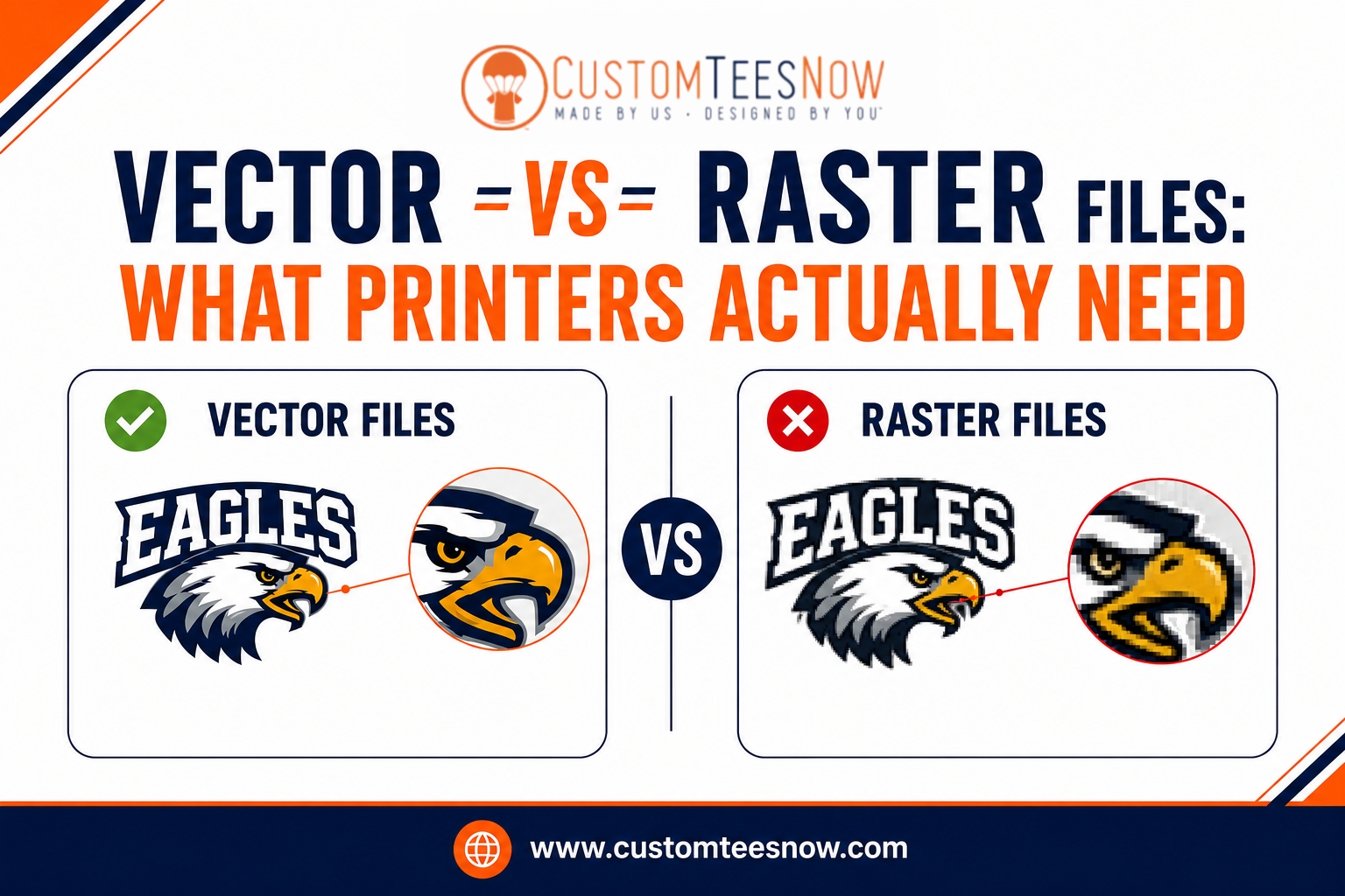
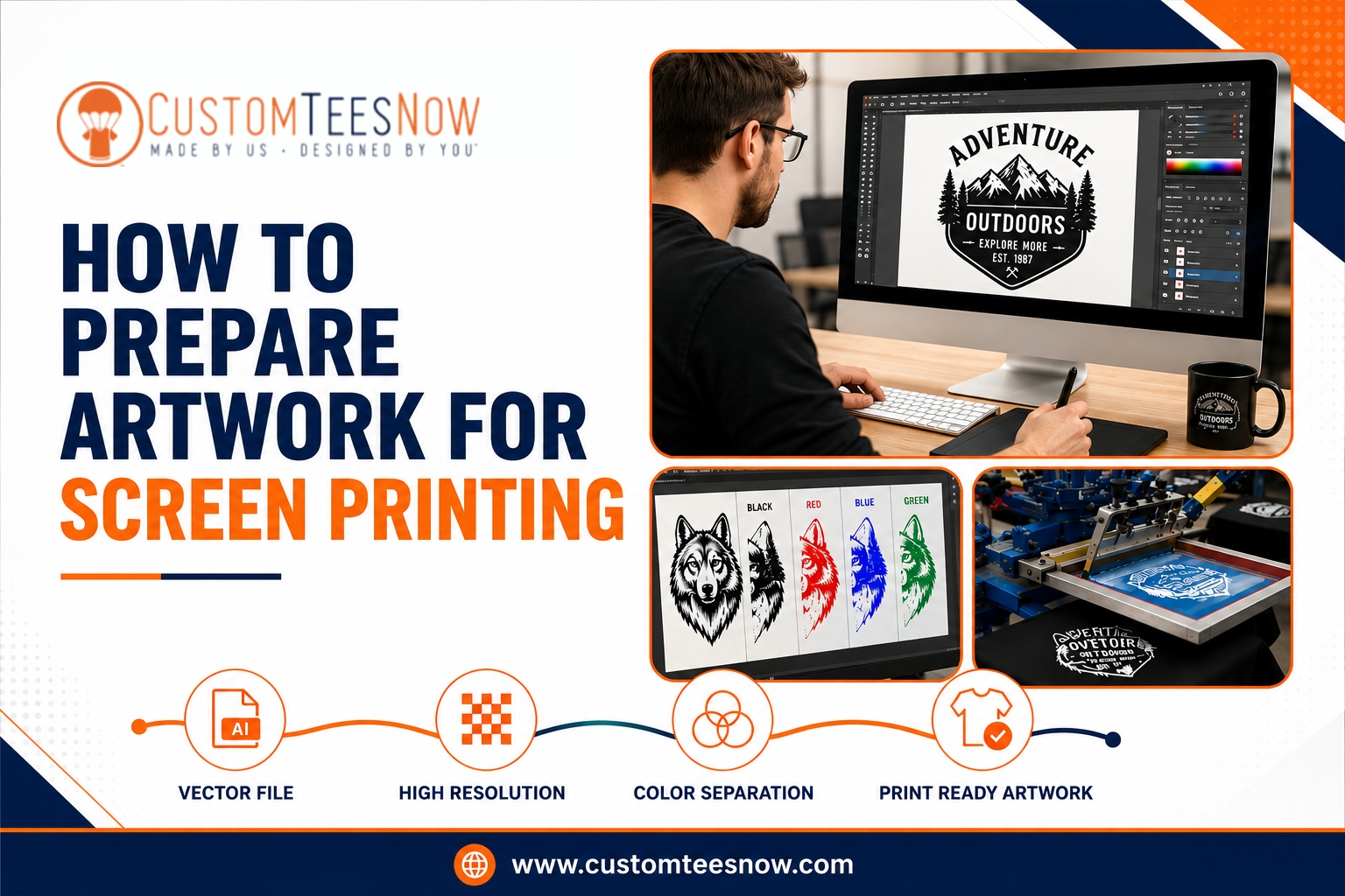
Poor Artwork Resolution and File Preparation
Low-resolution files rank among the top reasons designs lose quality in production. Submitting web-optimized images or graphics created at screen resolution often produces pixelated or blurry results on fabric. Professional printing demands higher standards—typically 300 DPI at the actual print size—to maintain sharpness in lines, text, and details.
Vector formats provide flexibility for scaling without degradation, making them preferable for logos and clean graphics. When raster elements are necessary, starting with sufficient resolution and avoiding excessive enlargement preserves clarity. Many projects suffer because creators overlook these technical requirements until proofs reveal problems.
Proper file setup extends beyond resolution. Organizing elements by color, converting text to outlines, and providing clear specifications streamline the process and reduce errors during separation and printing.
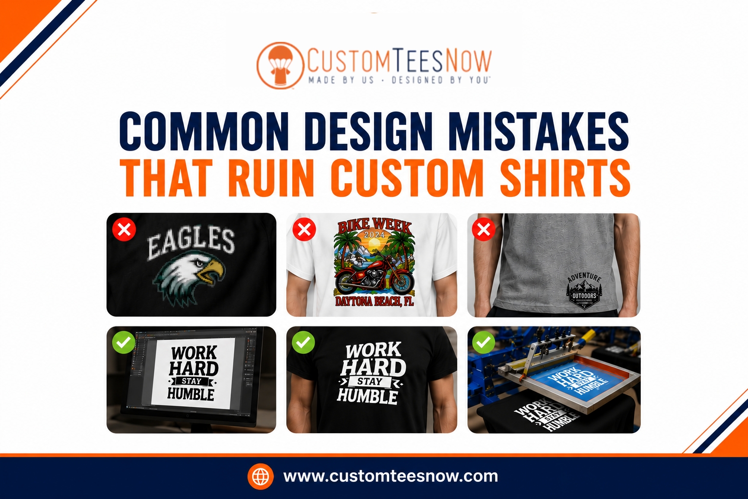
Overcomplicating the Design
Adding too many elements often backfires. Busy compositions with excessive details, multiple small graphics, or lengthy text become hard to read from a distance and challenging to print cleanly. What appears impressive on a monitor frequently looks cluttered or overwhelming on a shirt.
Simplicity allows key messages or visuals to stand out. Effective designs focus on one or two strong elements rather than trying to convey everything at once. This approach improves readability, reduces production complexity, and creates more timeless apparel that people actually want to wear.
Limiting color counts also helps. Each additional color increases setup time and cost while raising the risk of misalignment during printing. Most successful projects thrive with a restrained palette that maintains visual impact without unnecessary expense.
Ineffective Color Choices and Contrast Issues
Color decisions dramatically influence the success of any custom shirt. Inadequate contrast between the design and garment background causes elements to fade or disappear, especially on darker fabrics. Light colors on white shirts or subtle pastels often lack the pop needed to grab attention.
Ignoring color theory leads to clashing combinations that feel jarring rather than harmonious. Certain hues shift during printing or washing, particularly when not specified using standardized systems like Pantone. Dark shirts frequently require underbase layers for light designs, adding considerations that many overlook initially.
Thoughtful pairing of colors enhances visibility and reinforces branding. Previewing mockups on various shirt colors reveals potential problems early, allowing adjustments before committing to production and helps avoid bad shirt designs that fail to impress.
| Resolution | Using 72 DPI web images | 300 DPI at final print size |
| Color Count | 8+ colors in one design | Limit to 1-6 for most jobs |
| Contrast | Low contrast on garment color | High contrast for readability |
| Text Size | Tiny or overly decorative fonts | Minimum readable sizes, clean styles |
| Placement | Off-center or too low | Standard chest positioning guidelines |
This overview highlights key areas where adjustments yield significant improvements.
Bad Placement and Sizing Decisions
Placement mistakes transform otherwise solid designs into awkward wearables. Prints positioned too high near the collar, too low toward the belly, or off-center create unflattering silhouettes. Standard center-chest placement typically sits a few inches below the collar for balanced appearance across different body types.
Sizing presents another challenge. Oversized designs overwhelm smaller frames or wrap uncomfortably around sides, while undersized ones look insignificant. Full-back prints require different considerations than pocket or sleeve details. Accounting for how the garment drapes when worn prevents these issues.
Different audiences and uses call for tailored approaches. Youth shirts need scaled-down proportions, while athletic wear might favor specific zones for visibility during activity. Mockups and samples help verify that placement and scale work in real life.
Typography and Text-Related Errors
Text causes frequent headaches in custom apparel. Overly ornate or thin fonts become illegible when printed, especially at smaller sizes. Long paragraphs or excessive wording rarely translate well to shirts, as viewers have limited time to absorb the message.
Failing to outline text in design software risks substitution with default fonts, altering the intended look. Inconsistent sizing or poor spacing between letters further diminishes professionalism. Effective typography prioritizes readability and visual harmony with accompanying graphics.
Keeping text concise and impactful ensures the design communicates clearly even when viewed from across a room. Bold, clean typefaces generally perform better than script or heavily stylized options for apparel applications.
Legal and Originality Pitfalls
Using copyrighted characters, logos, or trademarked phrases without permission creates serious risks, including legal complications and order cancellations. Many creators assume fair use applies to personal projects, but commercial apparel follows stricter rules.
Original designs or properly licensed elements protect your project and build authentic brand identity. Relying on generic clip art or copied concepts results in shirts that lack uniqueness and fail to stand out in a crowded market. Developing custom artwork or collaborating with designers fosters creativity while avoiding infringement issues.
Neglecting Garment Quality and Comfort
Even the best design suffers when paired with poor-quality blanks. Thin, stiff, or ill-fitting shirts discourage wear regardless of print quality. Different fabrics—ring-spun cotton, tri-blends, or performance materials—offer varying levels of softness, durability, and ink compatibility.
Choosing based solely on price often leads to regret. Premium garments enhance the perceived value of your custom work and improve customer satisfaction. Considering factors like shrinkage, breathability, and care instructions ensures the final product meets expectations for long-term use and helps sidestep many custom apparel mistakes that stem from material selection.
Proofing and Communication Oversights
Skipping thorough proof reviews ranks as a preventable yet common error. Assuming digital mockups match final prints without verification leads to surprises in color, size, or placement. Multiple proof rounds with your printer catch issues before full production begins.
Clear communication about expectations, quantities, timelines, and special requirements prevents misunderstandings. Providing detailed specifications and responding promptly to questions keeps projects on track. Experienced printers offer guidance that helps refine designs for better outcomes.
For those seeking expert assistance with design refinement and high-quality production, visit our artwork preparation guide to strengthen your technical foundation before starting new projects.
Additional Factors That Impact Results
Beyond core design elements, several practical considerations influence success. Environmental factors like ink curing temperature and time affect durability—under-cured prints crack or fade quickly. Mesh count in screens must match design details for optimal ink deposit.
Testing small runs before large orders reveals potential problems with specific combinations of artwork, fabric, and technique. Gathering feedback from intended wearers during development ensures broader appeal. Seasonal or event-specific designs benefit from timely planning to align with current trends and needs.
Building Better Habits for Future Projects
Avoiding these common issues becomes easier with consistent practices. Start with clear goals for your custom shirts, including target audience, usage context, and desired impression. Create designs in professional software whenever possible, following technical guidelines for the chosen printing method.
Regularly review mockups on actual garments and order samples when feasible. Stay open to feedback from printers and test audiences. Over time, these habits lead to more confident decisions and consistently excellent results.
For additional insights into professional color standards, resources like the Pantone website offer valuable guidance on accurate matching systems used throughout the industry. Adobe’s design learning resources also provide helpful tutorials on preparing files for print production.
Creating Better Custom Shirts by Avoiding Common Design Mistakes
Many t-shirt design mistakes can be avoided with proper planning, quality artwork, thoughtful color selection, and careful attention to print requirements. From preventing printing errors and improving readability to avoiding bad shirt designs and other common custom apparel mistakes, every decision made during the design process contributes to the final result.
Whether you’re creating promotional merchandise, branded uniforms, event apparel, or custom shirts for personal use, taking the time to refine your artwork can make a significant difference. At Custom Tees Now, we help customers create professional-quality apparel through expert guidance, premium materials, and reliable printing solutions designed to bring every project to life.